7 Golden Tips for Smoother Ebook User Interface
Unfortunately, not every ebook author realizes just how important user-friendly interfaces are for their ebook. Even if you do realize this point, making usability happen can seem a little bit overwhelming amongst all the other things you might have to think about.

In a day and age where technology is breaking down boundaries, it’s easy to forget that an ebook’s user-friendliness can all too often be its make-or-break feature. A truly user-friendly ebook ensures that readers:
- Leave with the key pieces of information stuck firmly in their minds;
- Have an easy time making sense of how the ebook works and what they are meant to be doing with it;
- And have access to an optimum level of interaction.
Below are seven golden tips you can follow through with to ensure that your awesomely interactive ebook is a hit!
Establish how users will use your ebooks
Interactive ebooks are a terrific way to engage your readers – which is why a user interface that actually works is so important.
You need to establish how your users will interact with the interface they are looking at on the screen. This will normally involve swiping on the screen, tapping a button, using a mouse, or dragging items across the screen.

You need to focus on content that is easy for users to manipulate, whatever the size of screen they are using. If the items that users need to interact with are too small, you’re going to end up with a virtually useless ebook, which demands too much effort on the part of the user.
If items are too big, this will take up too much room and increase the file size. Think of what will happen if you’re getting users to fill out a questionnaire or quiz, or they’re playing a game – how will this work out for their interaction with the ebook?
Readability is top-dog
You can’t control what device your readers will be using. But you can control your ebook’s readability. It doesn’t matter how pretty and interactive you make it, at the end, your readers (and learners) need to have the same gains from your ebook, whatever device they are using.
Your focus needs to remain very firmly on; contrast, type size and the height of each line so that the reader’s eyes can pick out the text and other elements very easily. It also means you will have to think seriously about how readable text is (rather than beauty or style).
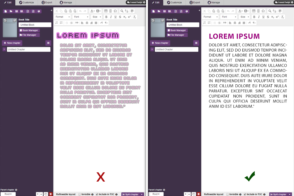
Neon pink text against a baby pink (or even a white) background isn’t the best idea ever – simply because neon pink is quite a bright colour and can hurt some readers’ eyes. This is why colour schemes such as black text on white/cream backgrounds are almost the default colour combination, simply because we all know this is the best contrast.
This is also where conducting your own tests on readability is important, to put yourself in the same position as your reader. It also allows you to view the text as your reader would, and pick up on any potential flaws. Whether it’s a smartphone, tablet, laptop or any other device, your text should still be readable.
You might like the look of that awesome font or the design and layout, but will readers still be able to read what they are looking at? It’s as well to also bear in mind the font size at this stage, as smaller screens will need smaller text size.
Think of your standard Kindle ebook. If you’re reading these digital books via a mobile app, for instance, you’ll see black text on a white background, with all other features copying that of a printed book. High contrast is a key element of the Kindle readers as well, with readers also able to zoom in and out of the text. This ensures that readers gain the same type size and line height, whilst, at the same time being able to zoom in and out of the page (and enlarge the text).
A good background read for creating good readability is can be found here, on elearningindustry.com – this is a great article to start getting your ebook’s readability off the ground.
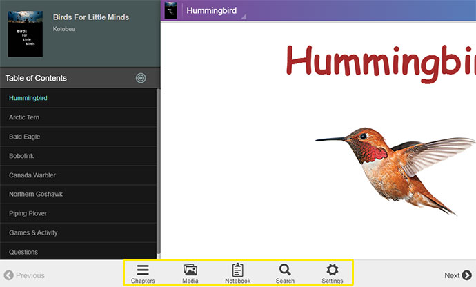
Provide users with familiar navigation controls
Don’t try to reinvent the wheel! Whilst it’s always a great idea to be innovative, readers still just want ebooks that are easy to use and easy to navigate.
This is where familiar devices of control and navigation come in, to make your ebook a best seller. These navigation controls simply make it easier for readers to move around the ebook, whether it’s easily jumping to the bits of information they need, switch between chapters, complete quizzes or the like.
This is where easily viewable and clickable buttons, icons and scroll down menus are important. Remember that the navigation designs we are most familiar with have remained fairly static over the years – and this is simply because everyone can use them easily.
There’s also nothing wrong with adding a bit of flare with colours and bold fonts as well. Experiment with design in such a way that readers still have an easy time of it at the end.
Although not an ebook as such, consider the BBC News app, which features a range of news articles, videos and audio-captures interspersed throughout the scroll down the page. The app is also very good at providing readers with a range of static navigation tools which remain visible at the top of the page as readers scroll down. Because the navigation bar is static, it doesn’t matter if the reader scrolls up or down – the navigation bar remains firmly fixed at the top of the page.
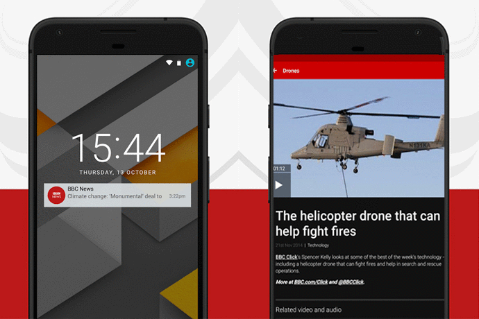
This ensures that not only can readers easily access other parts of the app at the simple touch of their screen. It also allows access to several scroll-down menus with further information that readers would want. The BBC take on navigation is supremely simple, and something that we have all seen before on so many websites. But because we live in a hectic world, we love this kind of navigation, simply because we already know where to look and for what.
If you’re looking for some further hints on creating effective navigation tools, then follow this link.
The right template makes the most responsive layouts
This is where you might just need to do a bit of research into design authoring tools that make the most responsive elearning tools.
As mentioned above, you can’t control what kind of device your readers will be using, but it may as likely be a smartphone as a tablet (especially with older learners). This is where interfaces with highly responsive designs are your best friend, as the content you create will adjust automatically according to the size of the screen being used.
It also means that you will need to create different breakpoints throughout your ebook that indicate where content will be displayed on the digital page. What the reader views will vary according to what device they are using, a feature managed by the Learning Management System (LMS). This comes down to the ebook’s navigability.

It is also where a good design authoring tool becomes your best friend; because you can simply pick out the templates you require, upload all content and then simply make the modifications you need.
Although there is, of course, the ubiquitous Adobe InDesign as a go-to for design of any kind, you can also import most formats of templates straight into the free version of Kotobee Author. Otherwise, some good sites you can consider for authoring are Lectora, Adobe Captivate, Articulate or Amvonet.
Navigability isn’t just click-ability
One of the major bonuses of ebooks is their ability to allow readers to access any part of the ebook they need at the simply click of a button (or tap of the screen). But navigability isn’t just confined to click-ability – it can also relate to the ebook equivalent of a website’s sitemap
This is where users have a one-stop digital page for resource list links, access to online libraries, a quick overview of what’s included in your ebook and the like. It simply acts much like a contents tool, giving readers the opportunity to jump to any part of their ebook as they wish – which is especially useful for elearning courses.
With this in mind, you also need to break down for readers what exactly they can access – from the main overviews and chapter topics right down to core topics that focus on the nitty-gritty. This can work just as well as tabs as it can scroll down menus, making it a lot more user-friendly.
Drop crumbs for your readers
Just like Hansel and Gretel dropped crumbs on the forest floor so they could find their way out again, you can do the digital version of this for your readers. It could be something as simple as clicking on a “Next” button or getting readers to answer a question correctly before they can move on.
This is one of the most effective ways to engage your readers effectively, and it’s also very simple! As with any user-friendly interface, this bridge over to the next part of the learning experience needs to be clear, either through text directing users to the next part, or it could be a button or call to action. It could even be an animated image that focuses the reader’s attention onto moving forward.
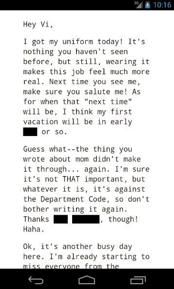
Another innovative version example of this is the interactive text game app, “Blackbar“. This unusual app-cum-ebook allows readers to fill in missing words in the text that have been “deleted” in Big Brother style. It’s an amusing way of introducing interactivity to the reading context.
Consistency is your best friend
There’s nothing like a good bit of consistency is there? Don’t doubt how much a reader’s subconscious comes into it either.
Think of hyperlinks on a digital page – by now, we all know that if a bit of text is bright blue and has a line underneath it, we can click on it and we will be taken to a new page or audio/video link. This is our subconscious at work here – and it happens in every hyperlink on every single digital page you will come across.
The more you change things around and lack consistency, the more confusing it will be for readers (and it will also be a lot more off-putting). You need to ensure that the colour, shape, and placing of a button is consistent throughout the ebook because readers won’t want to keep searching for something as simple as that.
Final thought
Although readers now expect authors, like you, to be more innovative in the way you use interactive ebook technology, you need to bear in mind that simplicity often trumps funky new designs. No matter how sophisticated you want to try to be, you should keep the above points in mind to create a user-friendly experience for your readers.
Whether it’s good readability, easy navigation or simply providing your readers with an easy way of moving around the ebook, you’ll find the above points help you polish your ebook for publication.
Did you enjoy the article? Have we missed any crucial tips? Let us know in the comments below!
You might also like:
When Should Your Ebook NOT Be Interactive